New Dashboard Object Display Options in 2.9
 Scott O'Reilly
November 12, 2015
Scott O'Reilly
November 12, 2015
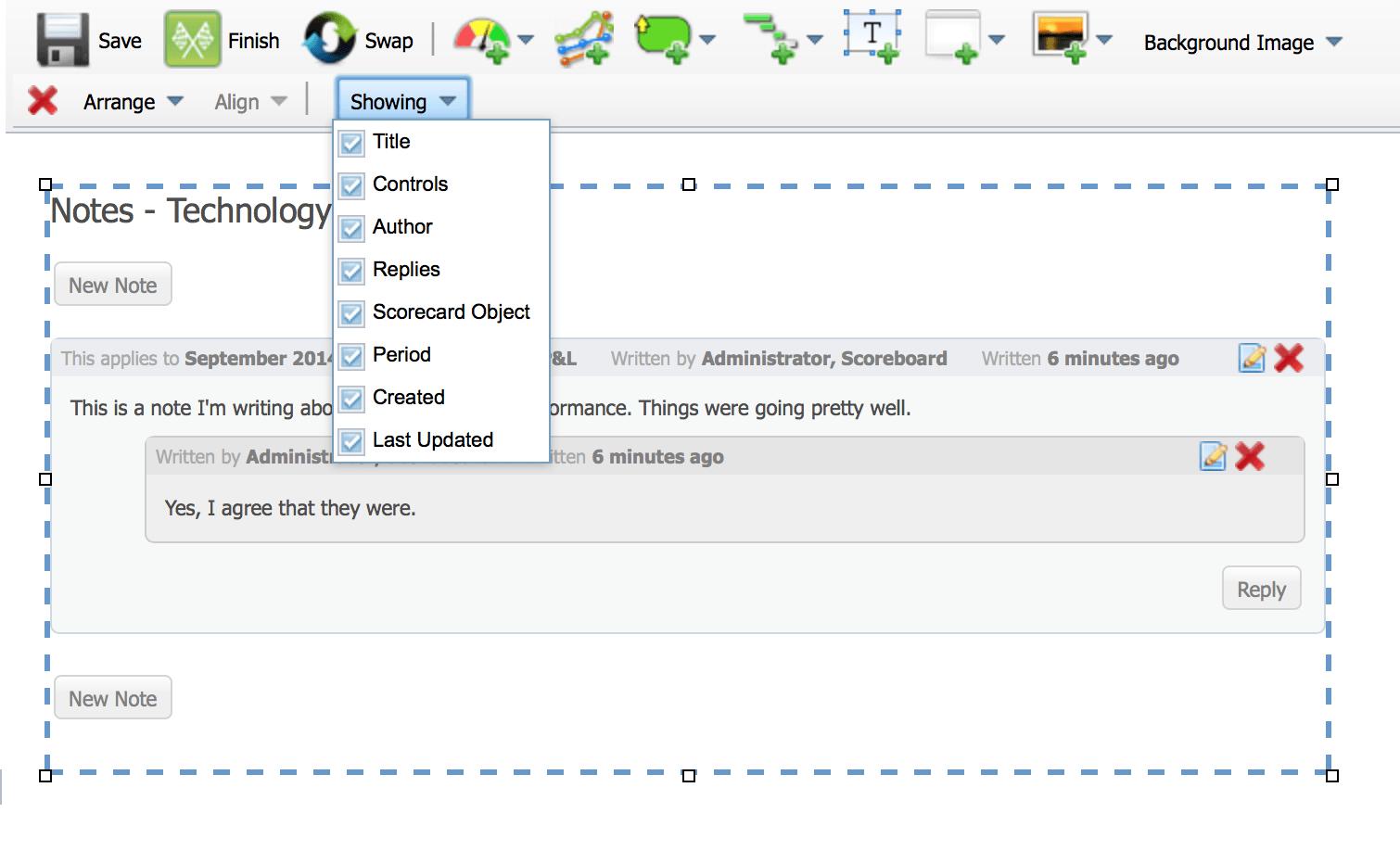
You can change many more display options for dashboard objects in version 2.9. For example, this is what a note looks like when you add it to a dashboard. In previous versions of the software you couldn’t turn off any of the display options like Title, Controls, Author, Replies, Scorecard Node, Period, Created, or Last Updated.
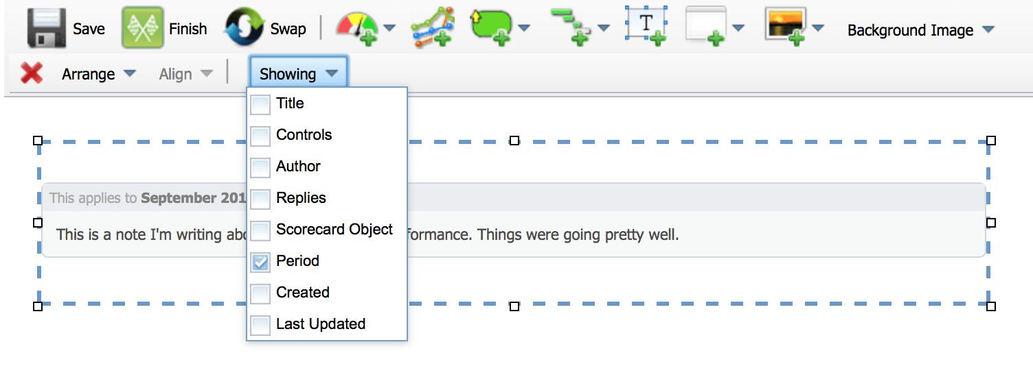
This is what it looks like with everything turned off except for the Calendar Period.
Reports also have a “Showing” menu now. This is the default appearance, which was the only option before.
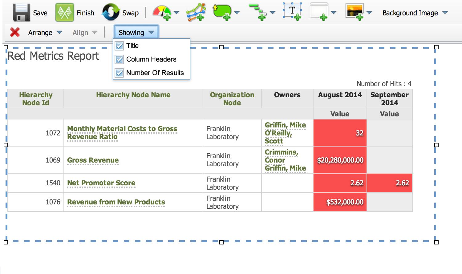
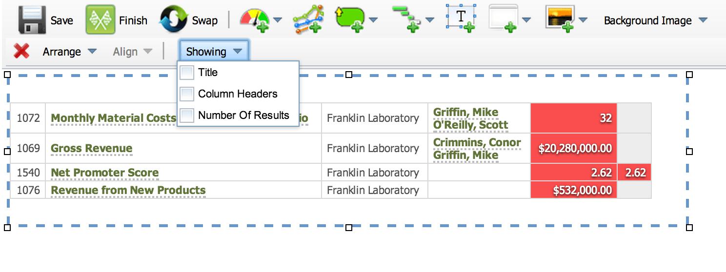
You can now turn off the Title, Column Headers, and Number of Results.
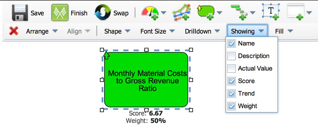
Dashboard bubbles had a “Showing” menu before, but in the latest version of the software there are new options. You can now choose to see a scorecard node’s Score and Weight.
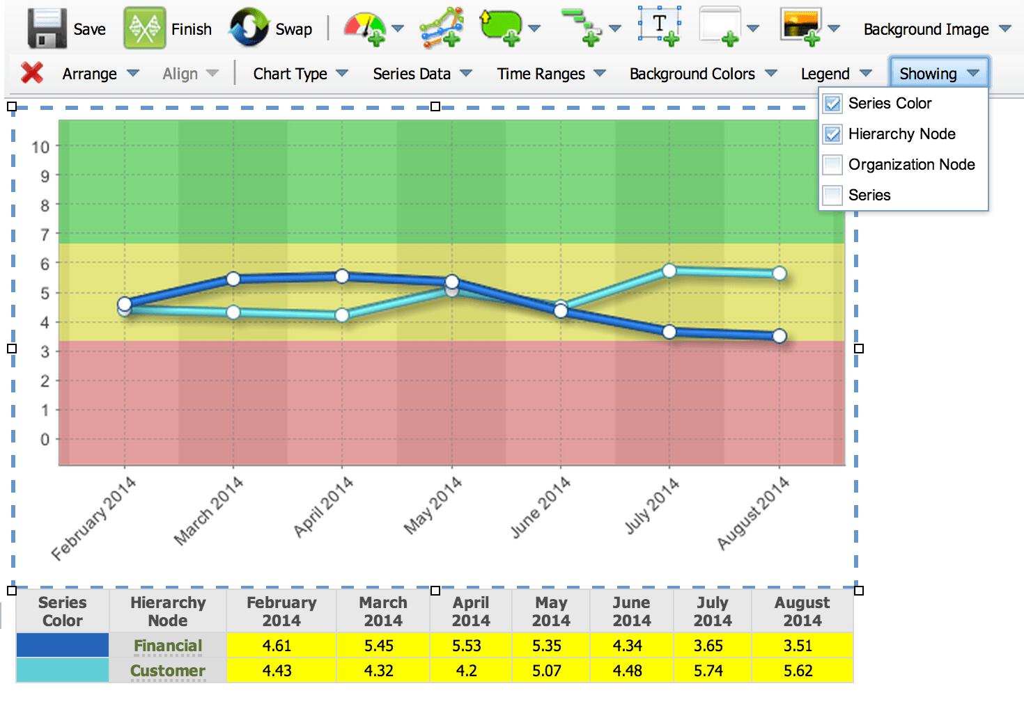
Finally, reports now have the “Showing” menu too. This is what charts always looked like in previous versions of the software.
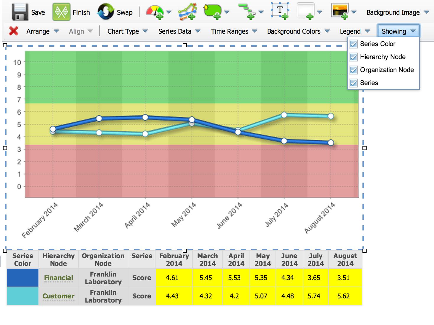
You can now turn off Series Color, Scorecard Node, Organization Node, and Series. In this example the Organization Node and Series aren’t needed, so they’re turned off.


Experience Spider Impact for Free
Schedule a live demo or claim your free 30-day trial. We’re standing by to either show off Spider Impact or turn your data into a prototype for free.