Good Looking Gantt Charts
Charts
 Scott O'Reilly
April 23, 2009
Scott O'Reilly
April 23, 2009
Scott O'Reilly
April 23, 2009
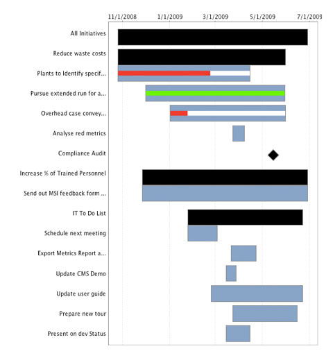
Two weeks ago I posted about how I spiced up the graphs in CMS. Well, now it's time for the gantt charts. This is what they looked like before:
And this is what they look like now:
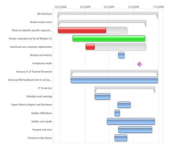
Quite an improvement if you ask me! Although things do look more attractive with the 3d shading, I think the real improvements are in readability. The partially complete tasks now make more sense, and the grouping categories don't get in the way. Keep an eye out for this new functionality in CMS 2.0 soon!


Experience Spider Impact for Free
Schedule a live demo or claim your free 30-day trial. We’re standing by to either show off Spider Impact or turn your data into a prototype for free.