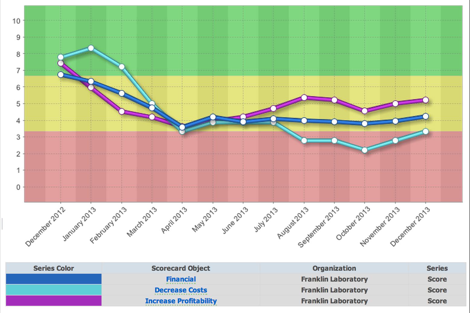
New Default Chart Colors in 2.8

When you create a chart, we automatically choose colors for the data series. In previous versions of the software, the color palate included colors like red, yellow, and green. This could be confusing because red, yellow, and green are also used to designate performance.
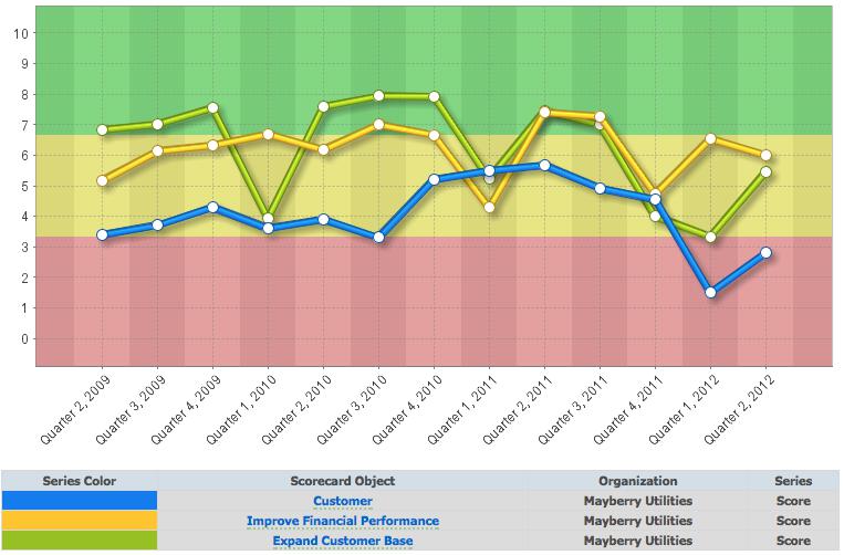
We've switched to a default chart color palate without red, yellow, or green. We don't want to mess up your existing dashboards, so this new color palate only applies to new charts you create.
This is just one of many changes we've made in version 2.8. If you'd like to be a beta tester, be sure to let us know!


Experience Spider Impact for Free
Schedule a live demo or claim your free 30-day trial. We’re standing by to either show off Spider Impact or turn your data into a prototype for free.