How To: Using Dynamic Values in Text Widgets
 Scott O'Reilly
March 23, 2021
Scott O'Reilly
March 23, 2021
In this article, we’ll review:
1. How to use dynamic values in text widgets, and
2. How to show performance bubble colors in text using Spider Impact.
You can use the following variables in text widgets:
- [today]
- [calendar]
- [calendar-period]
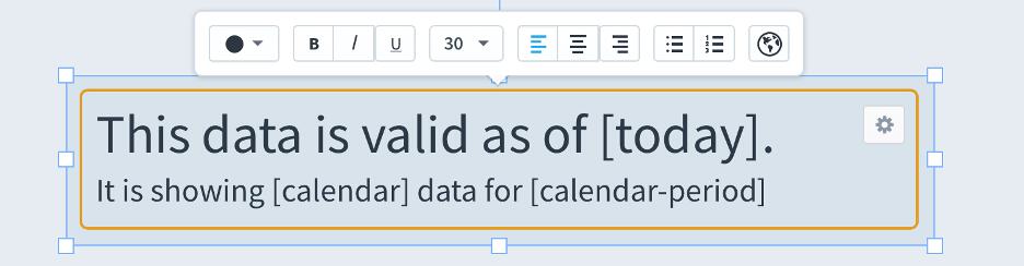
When you view the dashboard, these variables will be automatically replaced.

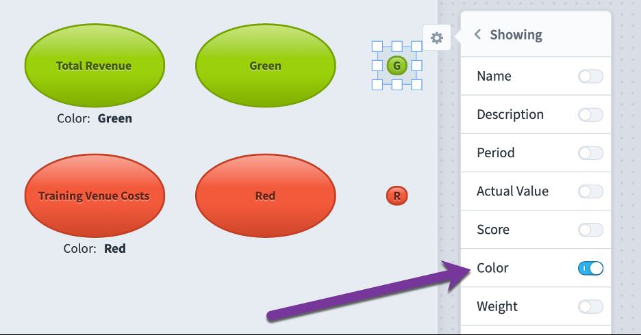
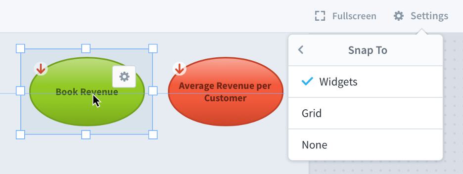
Showing performance bubble color in text
You can now choose to show a text version of the bubble’s performance on a dashboard. In the bubbles on the left, we are showing both name and color, so the color is displayed below. For the middle bubbles, we’re only showing color, so it puts the color name inside of the bubble. The right bubbles are very small, so it abbreviates the performance color to a single letter. This is very useful when building accessible dashboards for people who perceive colors differently.
Stay tuned for next week's article, where we’ll work with the X and Y axis in dashboards.
Interested in Experiencing Spider Impact for Yourself?
Request a Self-Guided Test Drive or a Live Demo.


Experience Spider Impact for Free
Schedule a live demo or claim your free 30-day trial. We’re standing by to either show off Spider Impact or turn your data into a prototype for free.