How To: Working with the X and Y Axes on Dashboard Charts
 Scott O'Reilly
March 30, 2021
Scott O'Reilly
March 30, 2021
Over the past several weeks, out blog has been dedicated to utilizing and leveraging dashboards features within Spider Impact. Today, we’ll focus on working with the X and Y axes.
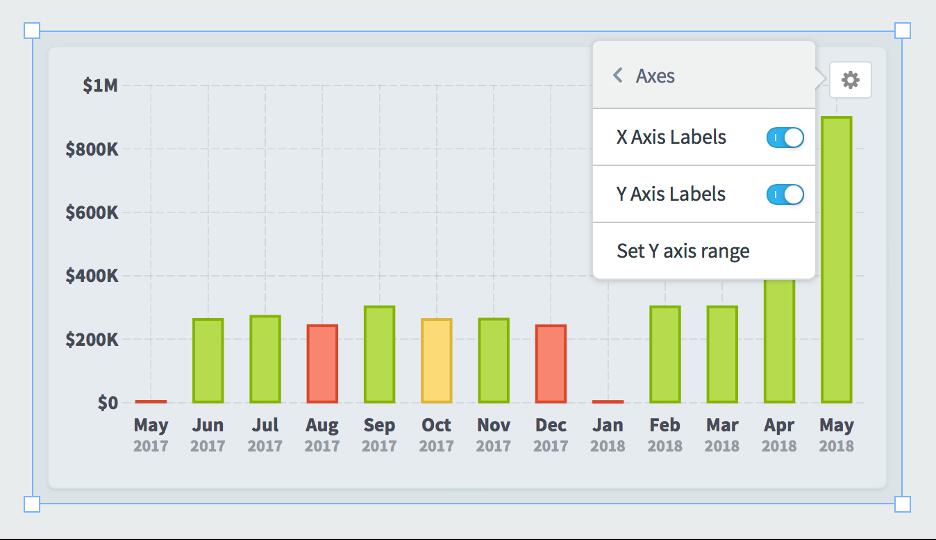
Removing chart X and Y axis labels
You can turn off X and/or Y axis labels on dashboard charts in Spider Impact. This example shows the default appearance with both axes turned on.
Here we’ve turned off the Y axis.
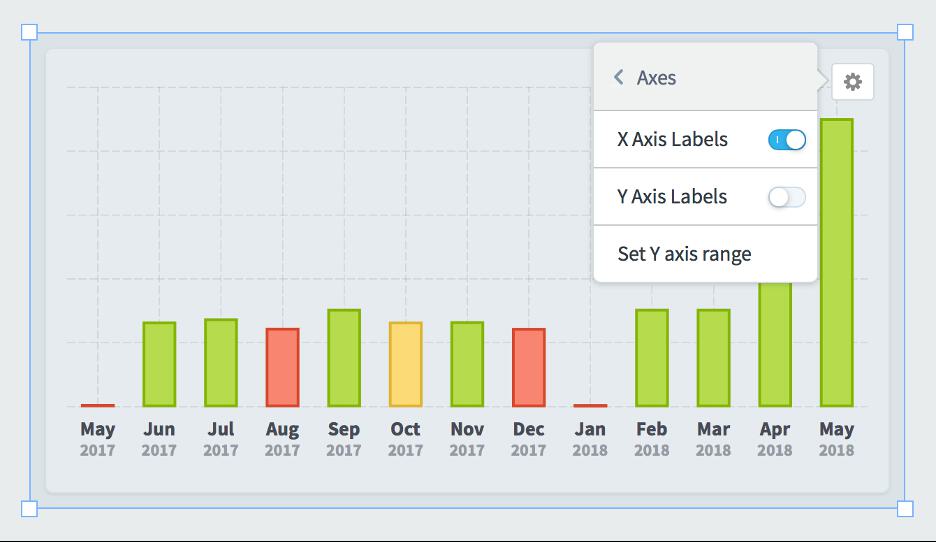
Being able to turn off axes is particularly useful when creating small charts that show a general overview of performance rather than specific numbers.
Manually setting chart Y axis min and max
By default, charts automatically determine their Y axis scale based on the data that they’re showing. In this example the chart range is $0 to $100k.
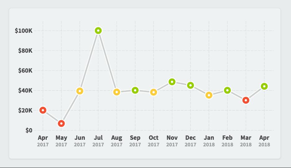
You can also manually override the minimum and maximum values by choosing “set Y axis range” in the widget configuration menu. In this example we’re forcing the maximum value to be $200k.
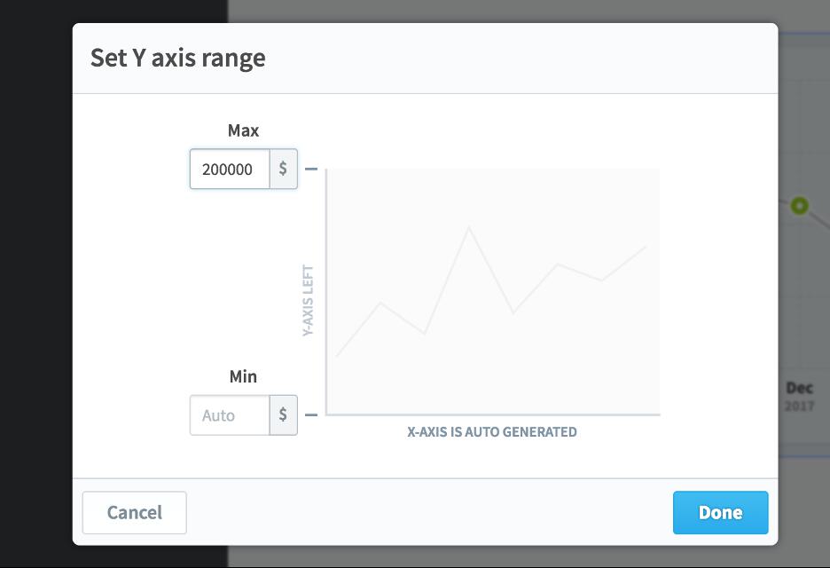
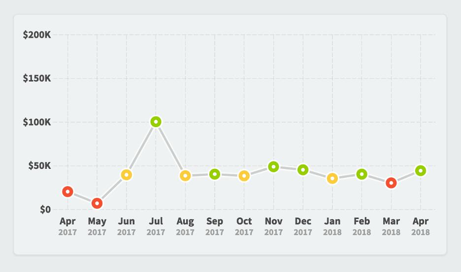
That creates a chart that looks like this.
Interested in Experiencing Spider Impact for Yourself?
Request a Self-Guided Test Drive or a Live Demo.


Experience Spider Impact for Free
Schedule a live demo or claim your free 30-day trial. We’re standing by to either show off Spider Impact or turn your data into a prototype for free.