Manually Setting Chart Y Axis Min and Max in 3.2
Charts
 Scott O'Reilly
October 22, 2018
Scott O'Reilly
October 22, 2018
Scott O'Reilly
October 22, 2018
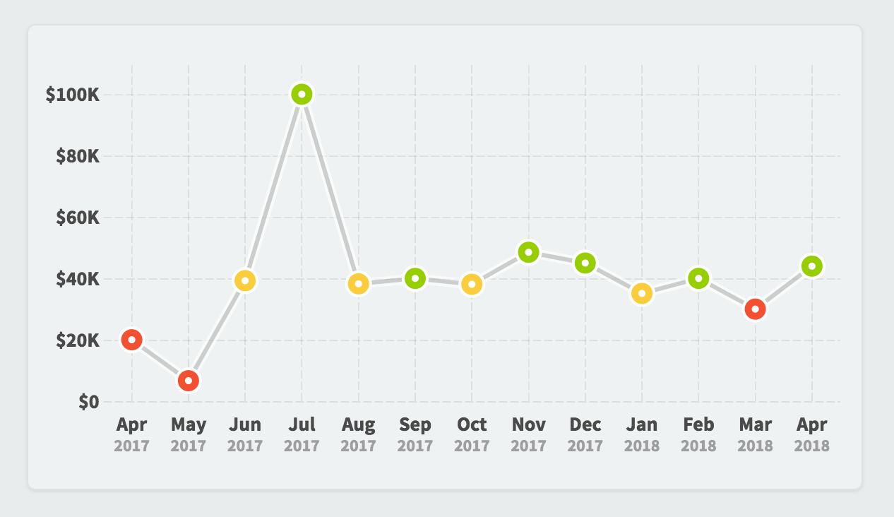
By default, charts automatically determine their Y axis scale based on the data that they’re showing. In this example the chart range is $0 to $100k.
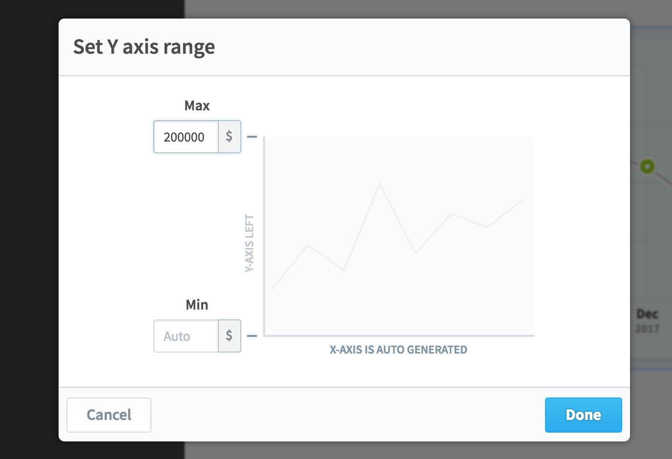
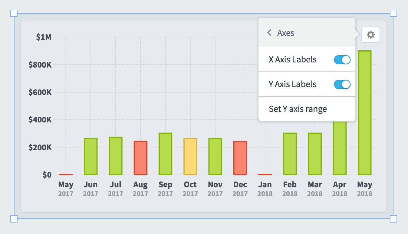
You can now manually override the minimum and maximum values by choosing “set Y axis range” in the widget configuration menu. In this example we’re forcing the maximum value to be $200k.
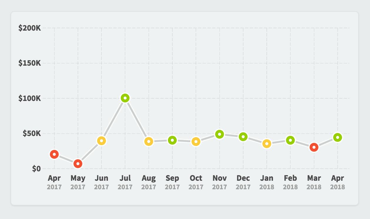
That creates a chart that looks like this.


Experience Spider Impact for Free
Schedule a live demo or claim your free 30-day trial. We’re standing by to either show off Spider Impact or turn your data into a prototype for free.